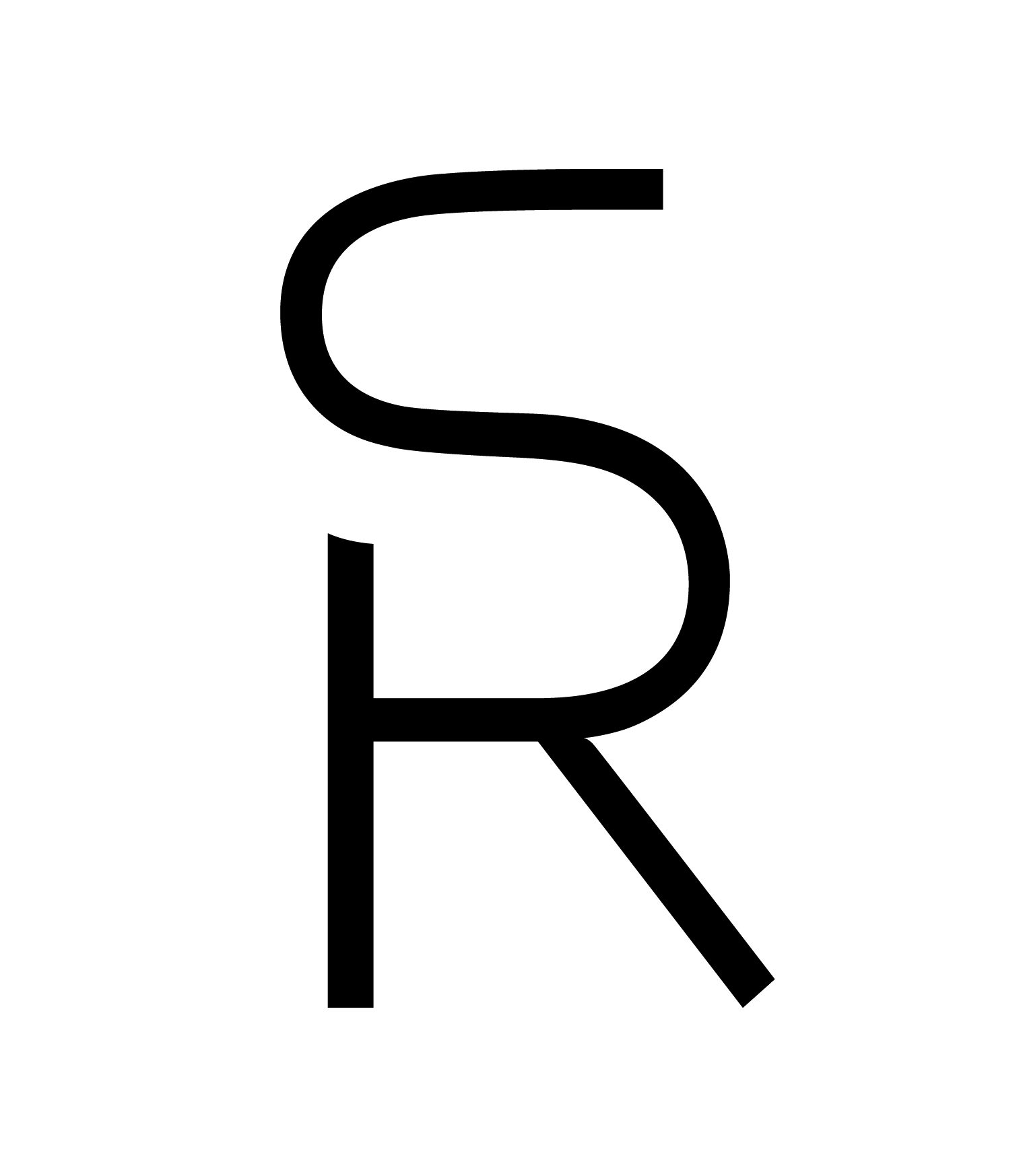
Client: Dr. Randy Smoot, Campbellsville, Kentucky, USA, oral surgeon
logo, 2014
Since so many dentists’ offices around the world use the tooth or teeth for their logo, I wanted to create something different. Dr. Smoot told me that he prefers letter designs which are used for branding cattle. Inspired by the long-time branding tradition in Kentucky, I decided to use the client’s initials for my design. The doctor’s surname, Smoot, was another inspiration: the letters need to be smooth to show his smooth style of working with patients. In this manually executed logo, my intention was to make a perfect symbiosis between the capital letters R and S which are “drawing” each other. Although I wanted an original typographic solution from the beginning, I also insisted on the perfect legibility of letters.
