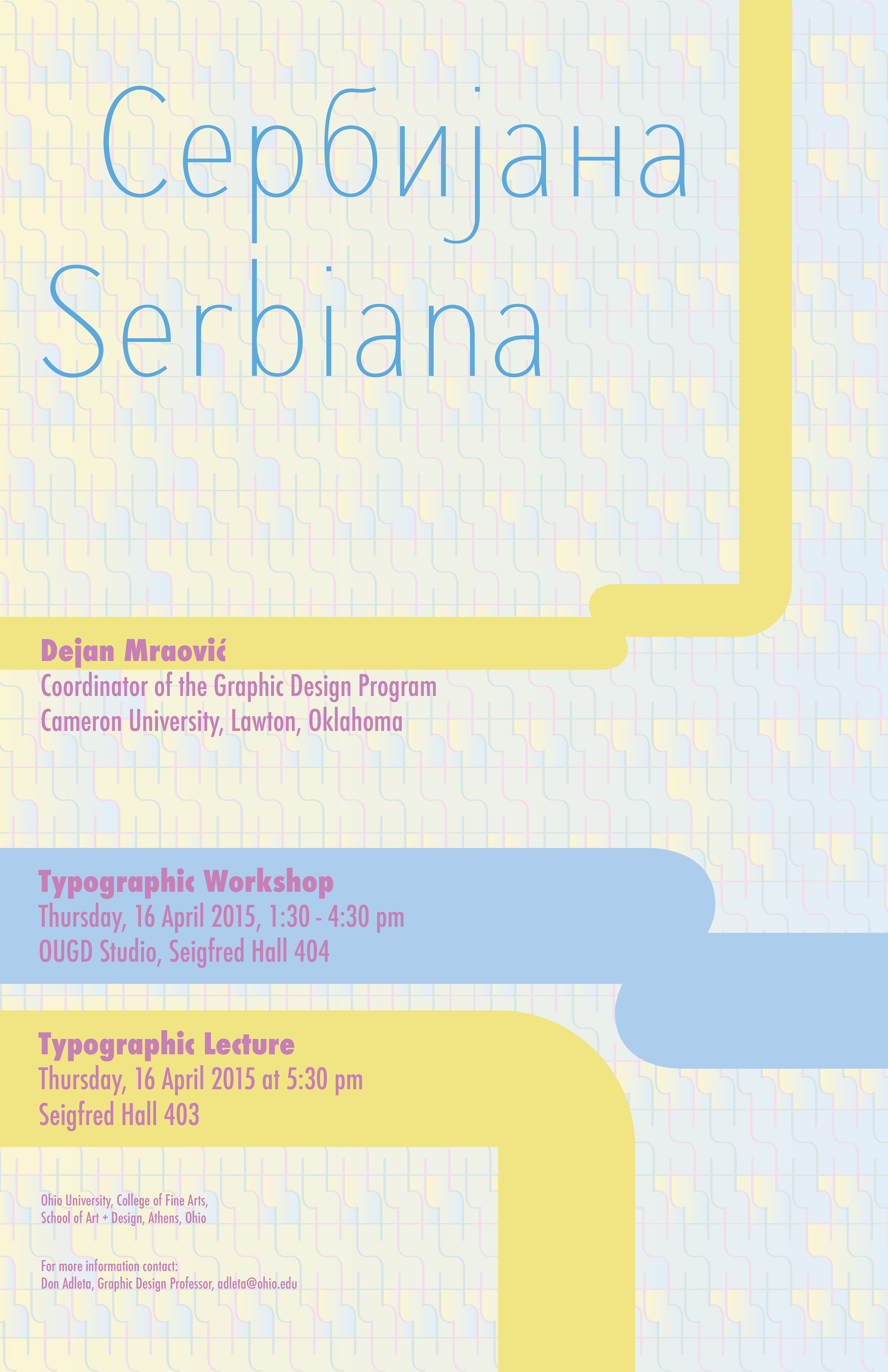
Client: Ohio University, College of Fine Arts, School of Art + Design, Athens, Ohio, USA
a poster for lecture and typographic workshop, 2015
To create a background for this tabloid size poster, I used a lower-case letter t from font Serbiana and multiplied it numerous times until I created a “fence like” pattern of very light appearance. The poster design is partially based on my 50 dinars banknote. The primary colors are used to attract the viewers’ attention.
2015: Published on SEEcult, Belgrade, Serbia (an online magazine for the culture of Southeastern Europe)
2015: Published on Designed, Belgrade, Serbia (an online magazine for design)
